
Project Description
Online dating has many challenges, and I founded this app to solve many of them. It replaced most of the problematic parts of dating apps with video.
Instead of swiping through potential matches, you’d join a weekly group video call. The host would lead exercise to warm up, then you would go on 5 speed dates (in 1-on-1 video calls) that lasted 5 minutes each.
The intention was to create an experience of being “invited into my living room, to meet my single friends”. Most dating apps had little cultural expectations set, leading to unpleasant behavior like ghosting, breadcrumbing, and worse. (Live video calls also prevents catfishing, another issue in dating.)
After each speed date, you’d select some ways the other person could improve, ways they’d been great, and finally select if you’d like to interact with them again.
If both people said yes, you were paired after the event, and could exchange messages and go on video dates (unlimited length video calls).
To prevent choice paralysis, a user could only have up-to 5 matches a time.
The app came about because I’ve previously coached people with online dating, so I have a great deal of domain-specific knowledge.
Skills Used
- User research (Zoom and Grain.co)
- Wireframing and interaction design (Figma)
- Prototyping (no-code platform)
- Information architecture
- Clickable prototype
- Managing engineers, researchers, and marketers
Problems with existing dating apps
- Cat-fishing (pretending to be someone else)
- Swiping (high volume of matches diminishes the perceived value of each match)
- Static profiles (means inactive users still appear just as active, lowering ROI for users)
- Connecting via text messages (hinders emotion and leads to confusion)
Initial hypotheses
People are…
- Unhappy with swiping apps
- Frustrated with how texting with their matches goes
- Open to more real-time virtual connections, e.g. video calls
- Want more focus on finding long-term relationships
User Research
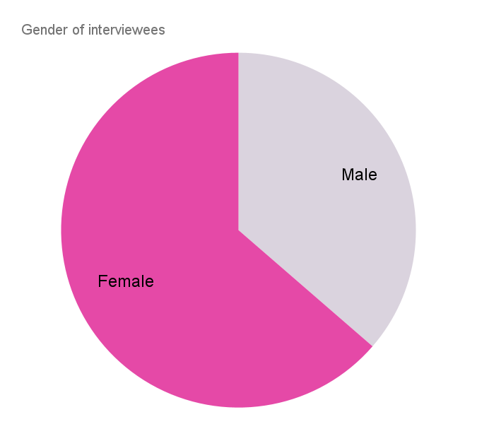
Conducted two rounds of user research.
First round of research: broad research with 11 people, looking for most common issues and frustrations.


- Video dates: Very mixed reactions, but majority were open to trying them — fits hypothesis
- Some women were hesitant about video dates, other women showed even higher interest in it than the men — fit my expectations as a dating coach
- Fair amount of interest in apps that use games or shared activities to connect — going deeper, this was mostly frustration with boring text messages
- Large number of potential matches on apps created choice paralysis and feelings of overwhelm, particularly for women
- Similarly, conversations frequently went silent (interviewee wasn’t interested, or their match wasn’t). That led to:
- sadness: seeing a long list of “dead conversations” (more prevalent for men)
- stress: sometimes match would reactivate the old conversation, when interviewee wasn’t interested, stressing out the interviewee (more prevalent for women)
- Since people rarely had 5 active conversations at a time, I suspected imposing a limit of 5 would decrease both issues
Second round of research: deeper understanding of frustrations. Mentored a junior researcher, and we created many journey maps and personas together:


Other personas we created because we saw them in both rounds of research, but chose not to target:


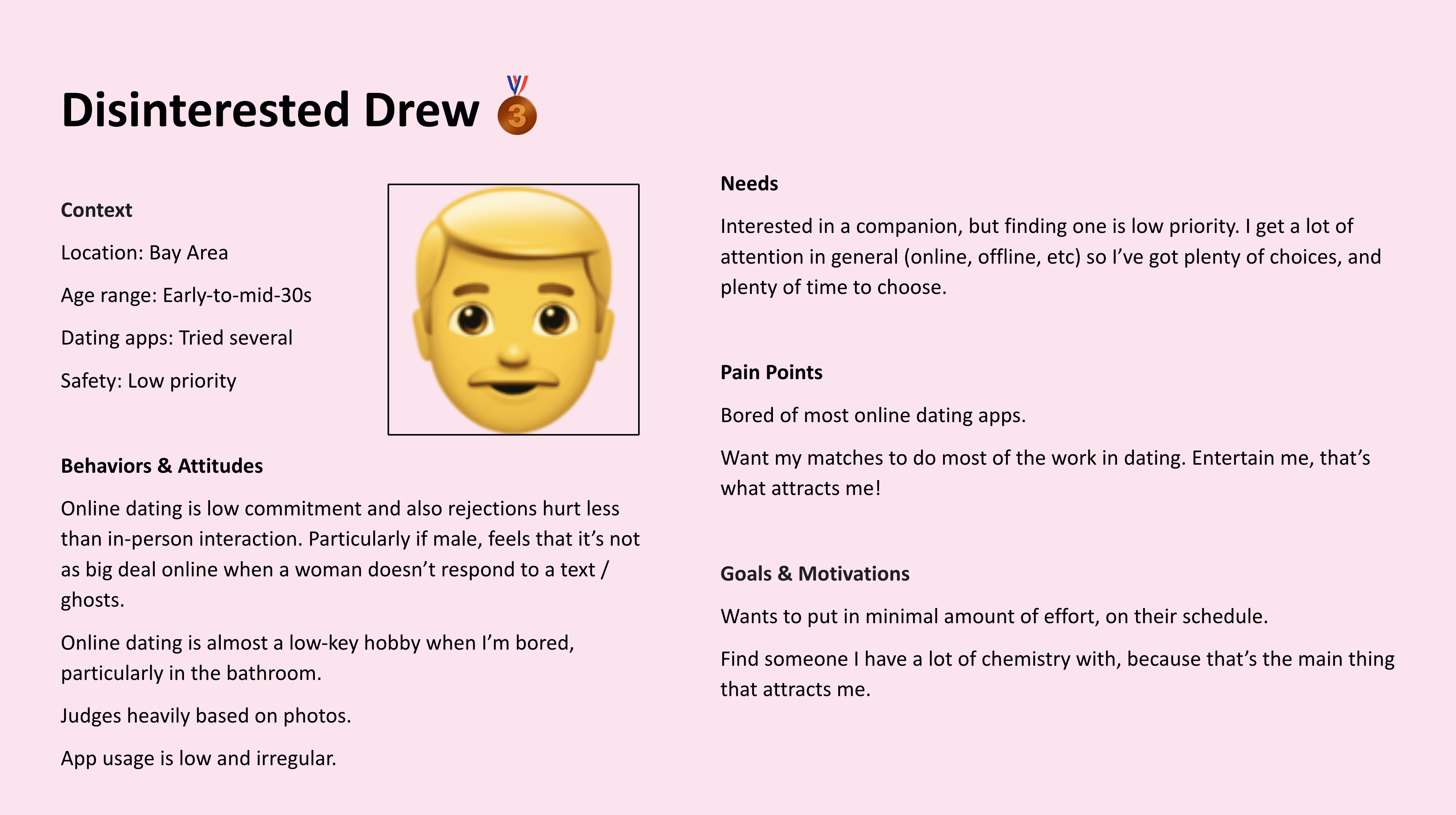
We chose Values Victoria as the primary user, particularly because her needs fit well with the hypotheses:
- Show what makes someone more aligned with your values (eg. views on family, religion) — designed questionnaires that could be filled out instead of writing [bland] profile text
- Photos don’t convey a person’s energy/personality which are important points of attraction — designed one-on-one speed dating to show
- Some matches respond with short answers, which makes it hard to keep the conversation going — showed suggested discussion topics in the one-on-one speed dating
- Also Genuine Gary’s motivation: I want to get beyond the superficial dating interactions and meet someone who is authentic, engaging, and can communicate openly about their thoughts and feelings — the suggested discussion topics avoided the superficial (e.g. “what’s your favorite band?”, “where’s the best taco?”) and instead focusing on depth:
- Who in your life are you grateful for?
- Do you want a marriage like the one your parents have?
- What are you famous for among your friends and family?
- What’s something you’re proud of?
- What have your partners most appreciated about you?
Initial sketching
I started by sketching some iterations of the Conversations (aka Matches) screen and one subsequent conversation. I was particularly interested in that because I wanted to make the focus of the app the conversations. Most dating apps focus on potential new people to match with, which contributes to choice fatigue and overwhelm. With CoupleUp, I wanted to flip that pattern on its head and prioritize your existing matches over potential new matches.

Left: only one video/voice message on-screen with next/previous buttons, maximized the size of each video, but felt clunky and outmoded.
Middle: conventional left-right text message worked, but meant videos were much smaller (or would constantly need “zooming” into a modal to play full-screen).
Right: showing the previous (and next) video mostly off screen, and allowing horizontal scrolling between clips balanced maximizing video size while using a more modern draggable interface. Of course it would also be the hardest to implement…
Bottom: simple, boring UI to select a conversation.

Left: much more visual way of selecting conversations, and also showing a Call To Action to sign up for the next speed date.
Middle: exploring what other data would be needed in the conversation
And also the information architecture. I wanted the first screen of the app to be Conversations (with existing matches) to further focus the user on going deep, rather than looking for yet another new match (which every other dating app encourages).

I also purposefully created a more useful flow for unregistered users, with information about when the next speed dating event would be, rather than just a landing page and “please register”. (A common pattern for many apps, especially dating apps.)
Minimum Testable Product (ala MVP) #1: Zoom + pairing by values
The first hypothesis to test was talking live on “video speed dates”.
I created a script explaining the idea (connecting live on video, instead of swiping), the context (“you’ve been invited into my living room”), the ground rules (5 minute speed dates, make a friend even if they’re not your type, don’t leave early), and how it would work (Zoom call plus breakout rooms).
Users were recruited by posting on an existing dating community, and asking friends & family to invite people.
I ran multiple “events” with single people, and gathered feedback via a Google Form. While excruciatingly manual for me as I ran the events, the forms were easy for people to use.
(I also collected data on people’s overall enjoyment of the events. Unsurprisingly, the more matches a person got, the more they enjoyed an event.)
The events produced enough matches and positive feedback to validate the idea, so on to the next stage!

Design deep dive!
Existing dating apps all focused on text messages. A few allowed voice or video messages, but those were rarely used. Based on the research, the second hypothesis was that text messaging was a major problem. So the decision was to remove text messaging entirely, to encourage users to send video messages. To test video messaging, I needed a simple app to record, upload, and view the messages. So I started a deep dive into designing it.
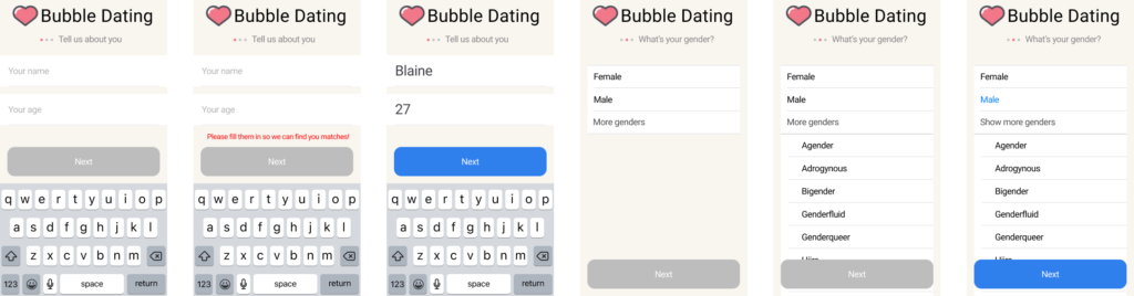
I chose to minimize the fields in the sign-up process. (Dating apps typically require filling out quite a few fields to start, sometimes as many as 50!)
From there, they would be shown a tutorial video conversation with a test user which provided a quick tutorial for them. I also showed the actions the user could take from that point:

The user could then switch to the Speed Date screen, which reminded them how it worked, and allowed them to join. Unless they already had 5 matches (one of the differences of this dating app), in which they had to unmatch at least one person to be able to join.

Once they joined the speed dating event, they would see this interface. The user’s own video was kept very small because many interviewees mentioned how distracting it was to see their face, especially on Zoom and Instagram (which show your video the same size as their video). FaceTime and Skype present your own video much smaller, which is what I patterned this after. A few even asked to turn off the view of themselves entirely, which I put onto a list of potential future features.


Wait, “minimum testable product”, remember?
I’d fallen into the trap so many of us do when building something — build everything at the beginning! “Minimum testable product” means just building what I need to test the next question, which was “will people send video and voice messages?” I realized I could wait on almost everything I’d designed:
- Instead of building in video speed dates, I could continue using Zoom
- Instead of information about the upcoming speed date, I could notify users via email and calendar invites
- I just needed to build
- select conversation to view
- select and play 1 video or audio message
- record video and audio
So going back to my sketches above, I chose the simplest methods for tasks 1-3. Using a no-code platform, I quickly built this much simpler messaging-focused MTP.
I ran more events on Zoom, which yielded a consistent numbers of matches, and then had the users install the MTP. But few messages were being exchanged after matching. When I reached out for feedback, people enjoyed receiving video messages, but did not enjoy recording them. Partly because they had to worry about how they looked (so a number of women would dress up to send a message). Also because they had to think about the background, and if someone would
So I tweaked the app to allow sending audio-only messages, and ran further events. This improved the number of messages, though it wasn’t to the level that I hoped. I considered this partially-validated.
Interviewed users for feedback on prototype
Before going back and actually building the whole app, I wanted to see what had worked well, and what had worked badly, for people. I conducted interviews over Zoom using Grain, an awesome transcription and annotation tool. It allowed me to take notes live, and have them synced to the recording. It also allowed me to pull out clips later for analysis and sharing.


Overall the feedback was quite positive:
- People loved the idea of video dating, and the vibe I created when I led the events
- People loved the structure of the Zoom calls, particularly the discussion prompts
- As mentioned above, sending video messages was too intense for some people
- I was repeatedly asked how often I could hold events!
Graphic design exploration
Satisfied I was on the right track, I hired a graphic designer to create the visual design, since that’s not a strong point in my skills. To make sure we were on the same page, I created a mood board.
As mentioned, the intention was to create an experience of “being invited into my living room, to meet my single friends”. So there was a great deal of focus on creating feelings of:
- warmth
- safety
- excitement
- playfulness
- tolerance
I also included notes on things to avoid, notably:
- overly harsh or dark designs
- hard to read fonts
- designs that were too masculine or too feminine

We worked together on the design, and eventually they narrowed it down to 4 possible visual styles:

After polling users and friends, the first color scheme was the clear winner. The other colors were considered “exciting but loud” and “too harsh”, whereas purple was “fun, interesting, and exciting”.

Clickable prototype before implementing
More design iterations
From there, an engineer and I built the app in Swift. We used Twilio’s Programmable Video SDK to create the video streams.
One interesting challenge was changes requested by Apple’s App Store team. For example, the app wouldn’t work without the microphone and camera. So I’d originally designed the screens requesting access to have helpful arrows:

Unbeknownst to me, Apple had forbidden that design pattern. After a few rounds of email back and forth, I was able to get on the phone with the App Store team to understand the problem. I removed the arrows, and then resubmitted with fingers crossed… and it was accepted! Fortunately I was able to keep the 1st and 3rd screens, showing the request and success.
Name change
Over time, there was increasing confusion with the existing dating app Bumble. So I conducted research (including some focus groups) on other names.

A broad survey with all the name ideas I’d come up with, plus more suggestions from the community. It got 66 responses.
Then I narrowed it down to 4 top contenders (plus the original name) and went into more depth on each name.
I asked a free-response question about the emotions that came up, as well as attributes that described each name (not pictured).

Ultimately I decided on “Couple Up” as the best name, and rebranded.
App Store release

I focused on the needs and frustrations people had expressed in writing the content for the App Store listing. Also tried to show both faces (since that’s known to be attractive and encourage downloads) and the unique features of the app.
Website
To make marketing easier, I built a landing page for the app. The website was completely focused on getting people to sign up, so I didn’t make it too long. It also had a “waitlist” link for people on Android.
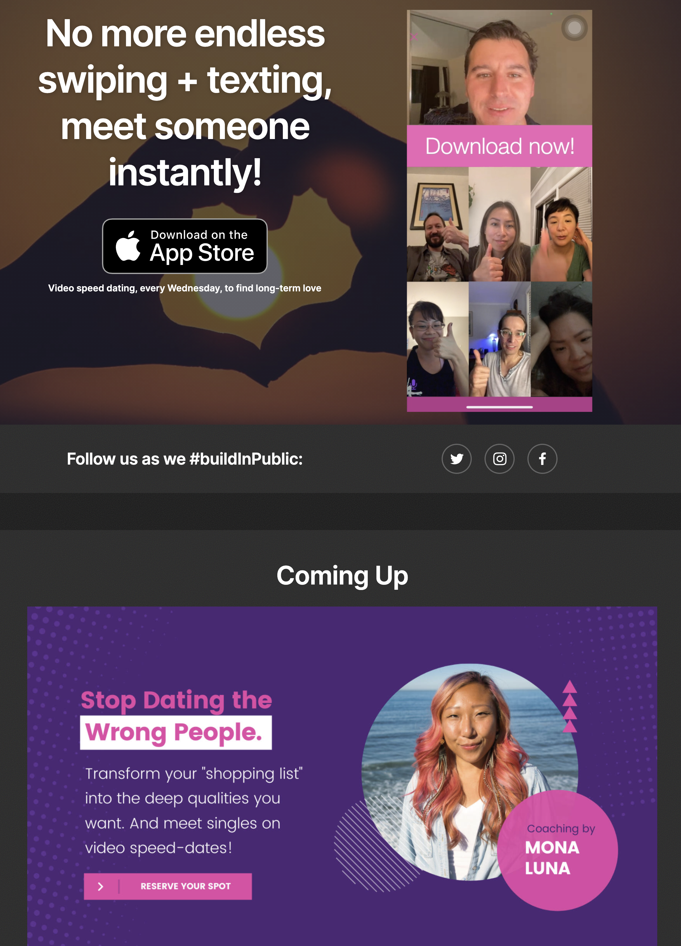
It began with the value statement, demo video (also shown at the top of this page, and on the App Store), and upcoming events.

After that it described the benefits of the app in more detail.
Growth
Once it was implemented enough to run events, I started advertising to gain more users. I also managed a number of freelance marketers in growing the users.
Unsurprisingly, growth was quite challenging, but we were able to grow 3x from the original test users, with 45.1% in the core location and demographic fit.